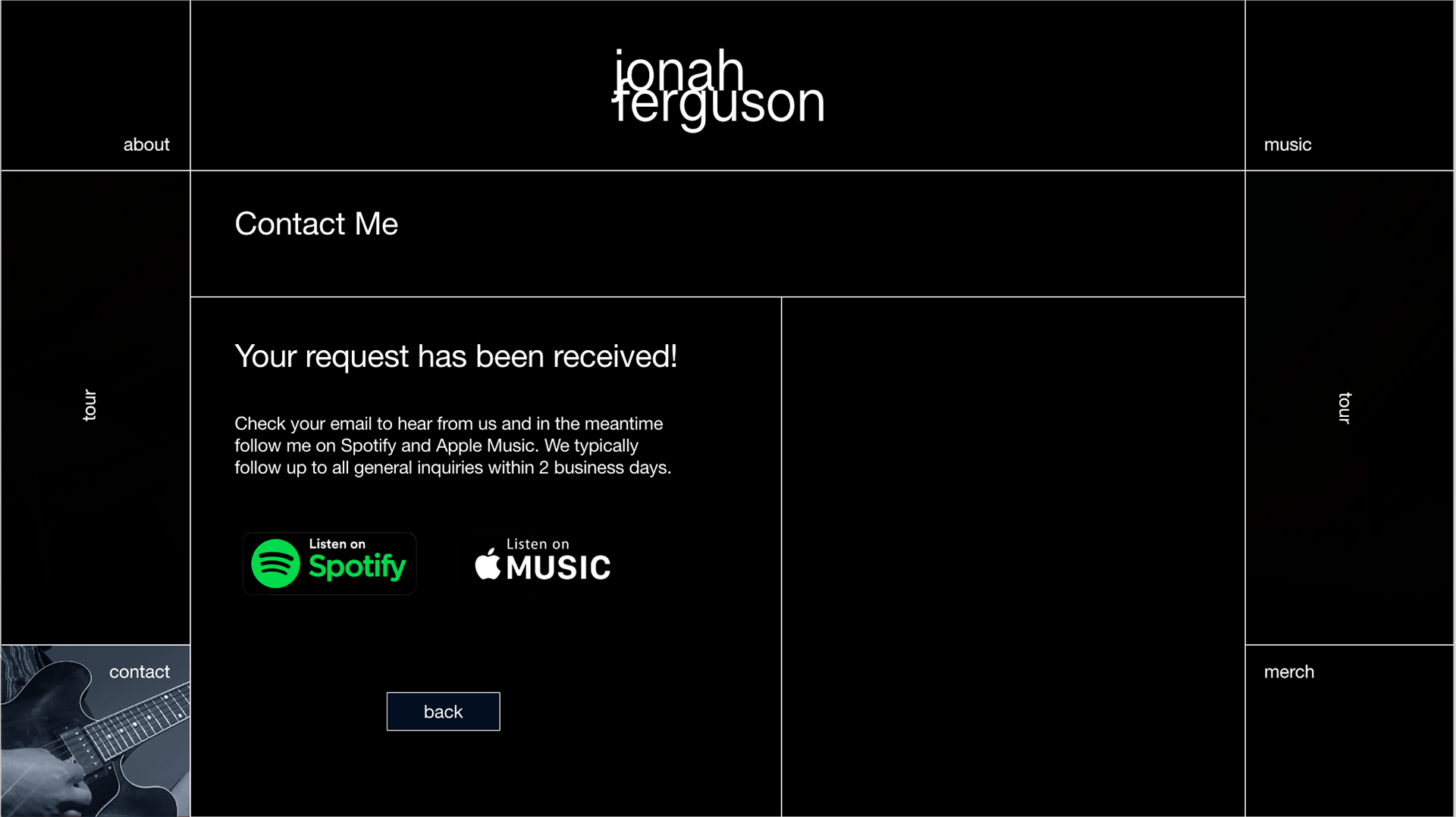
In this freelance project I was tasked with designing a logo, business card, and website for a jazz musician.
WIREFRAMES
These are incredibly rough sketches trying to make sense of layout and just getting a feel for what elements would be necessary to have on the site. What sections are needed and how could they possibly be arranged? The client, a jazz musician appreciates brutalist design and deep dark hues and wanted a clean minimal look that would fit in with their desired location of New York or LA inspiring a dark, color palette.

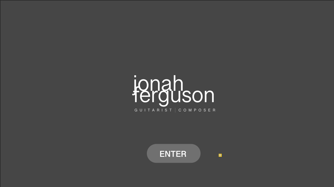
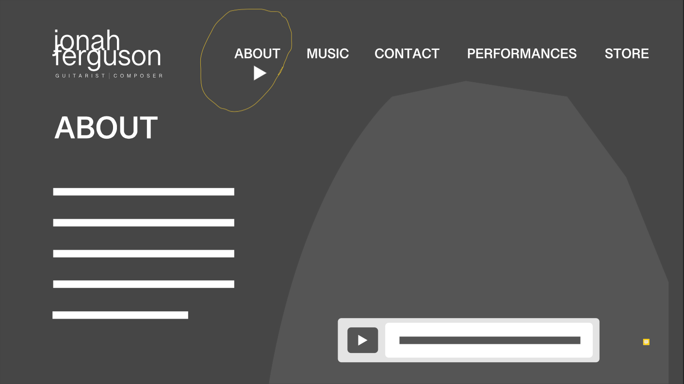
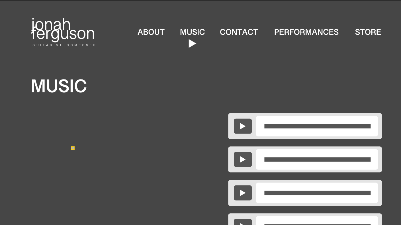
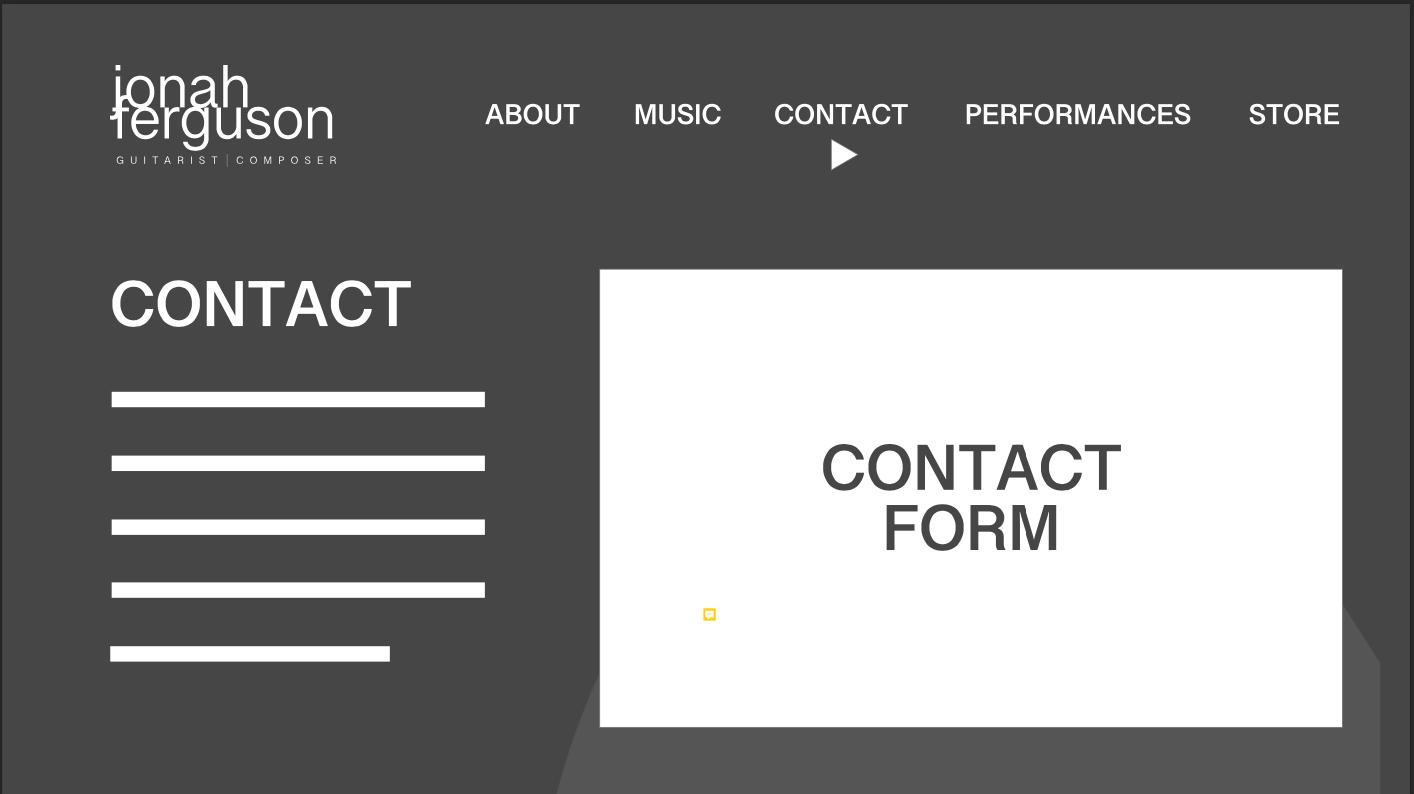
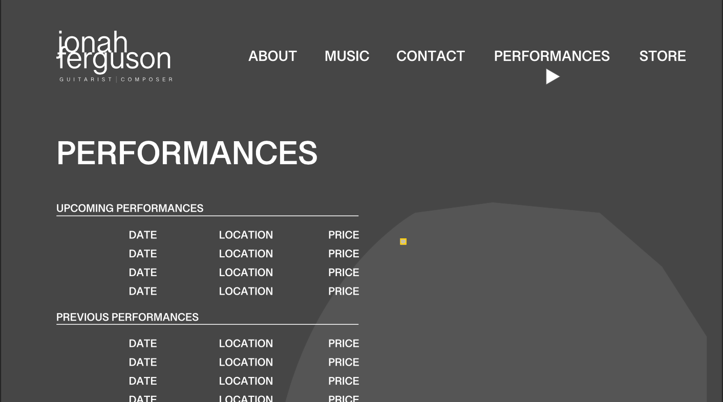
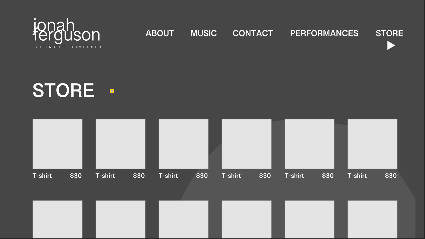
These wireframes consider how brutalism could influence the design. While this was enjoyed, the client wanted to pursue a different direction opting for black and dark blue with smaller type.
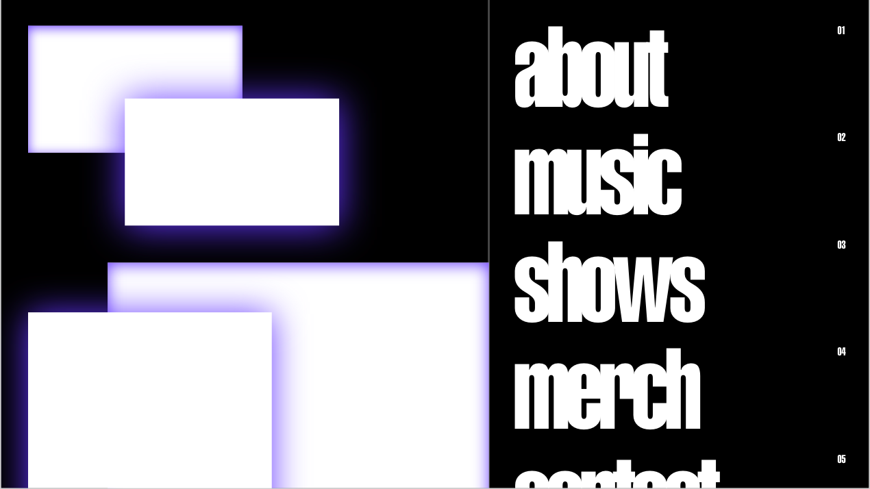
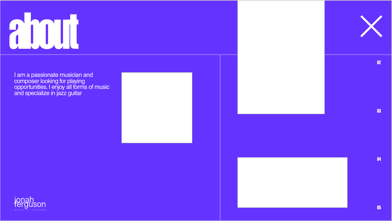
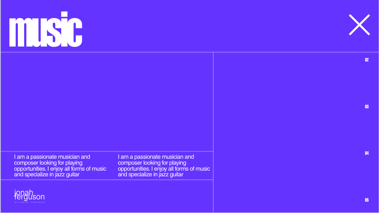
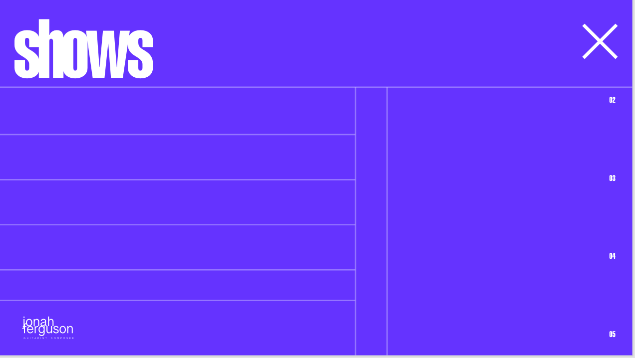
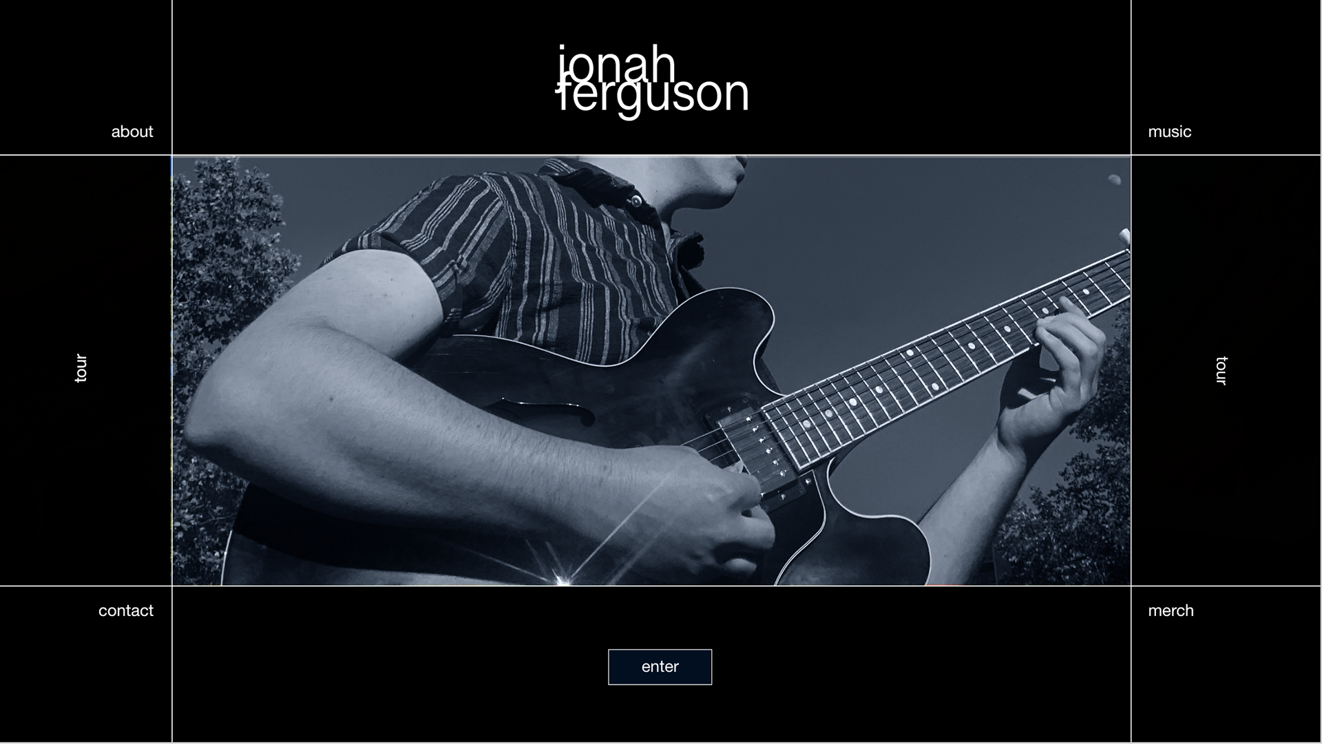
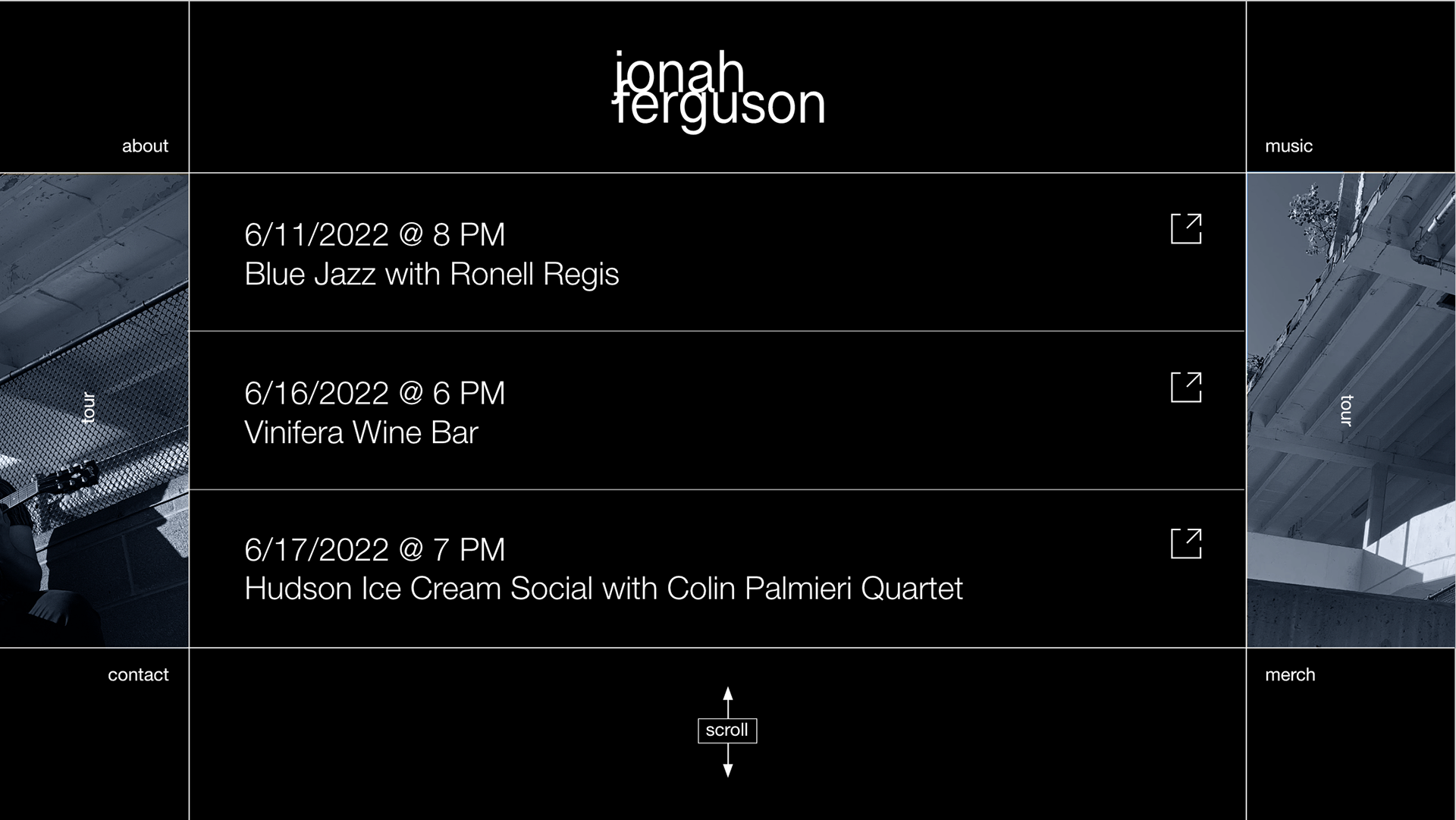
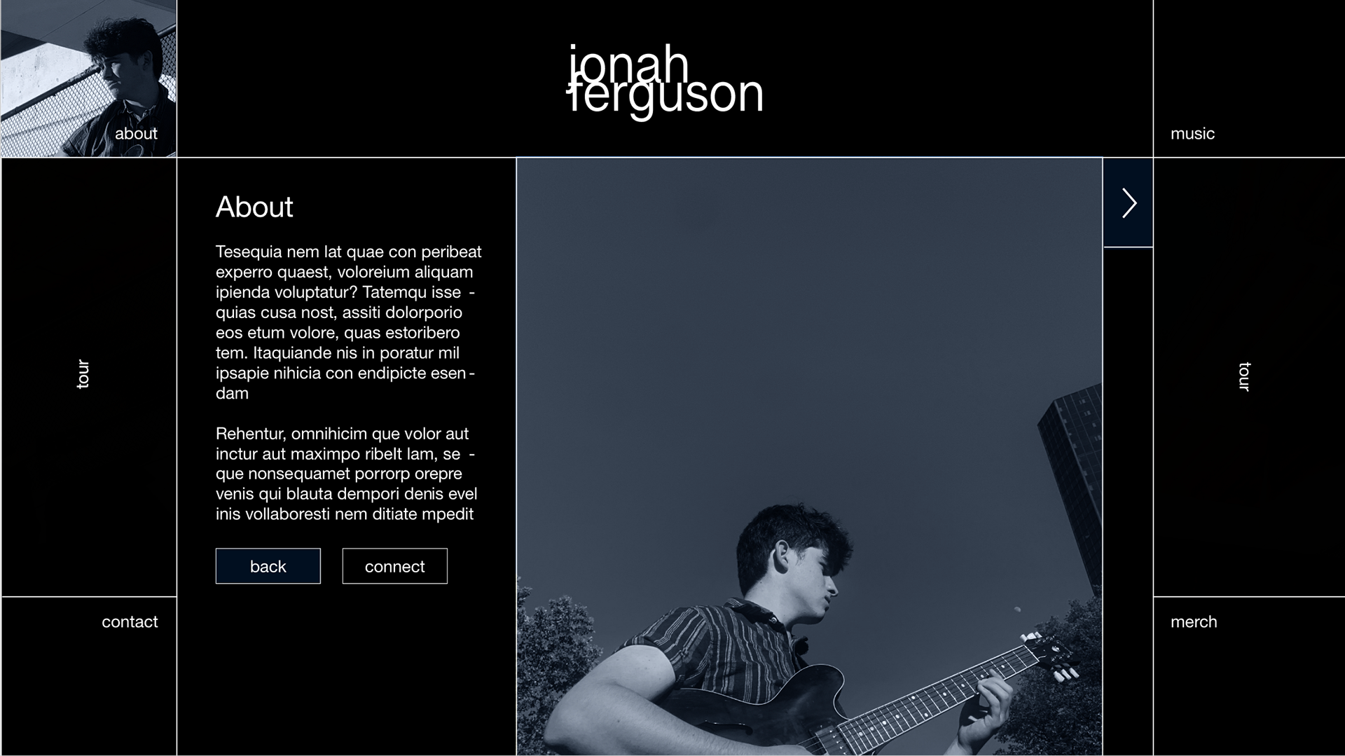
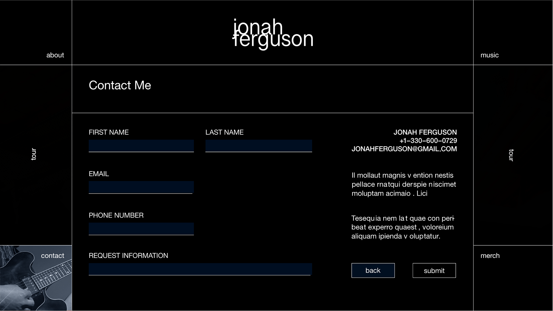
FINAL PROTOTYPE
This is the final prototype before testing for user insights. To take a look click on the link below:
https://xd.adobe.com/view/c906e5a6-0c19-48ca-b54b-246991294596-9c55/
